
Conversion Architecture: How to Design a Service Page That Generates Calls
Forget Me Never Media has generated 15,000+ leads across our client base. Most of those leads came from service pages built around one question: what does this specific visitor need to see, in what order, to feel confident enough to pick up the phone? That question — and the architecture that answers it — is what separates a service page that generates revenue from one that collects traffic and produces nothing.
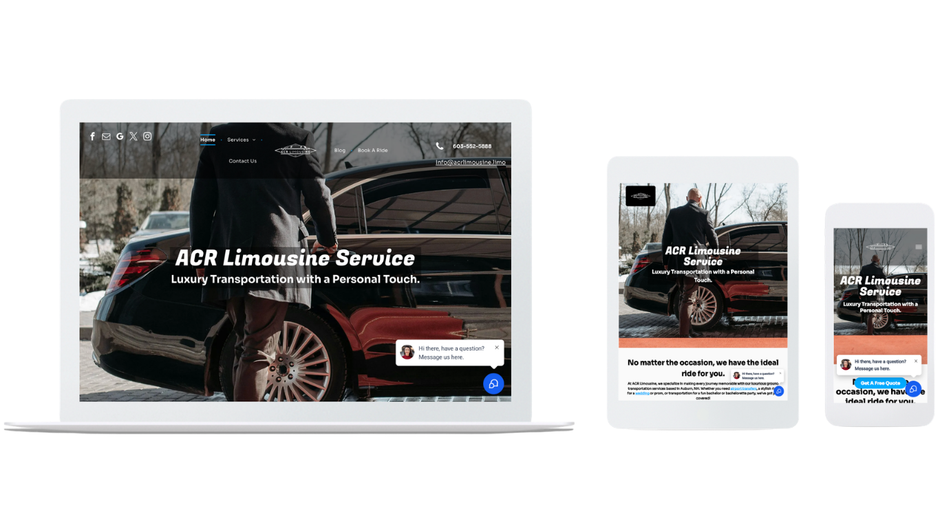
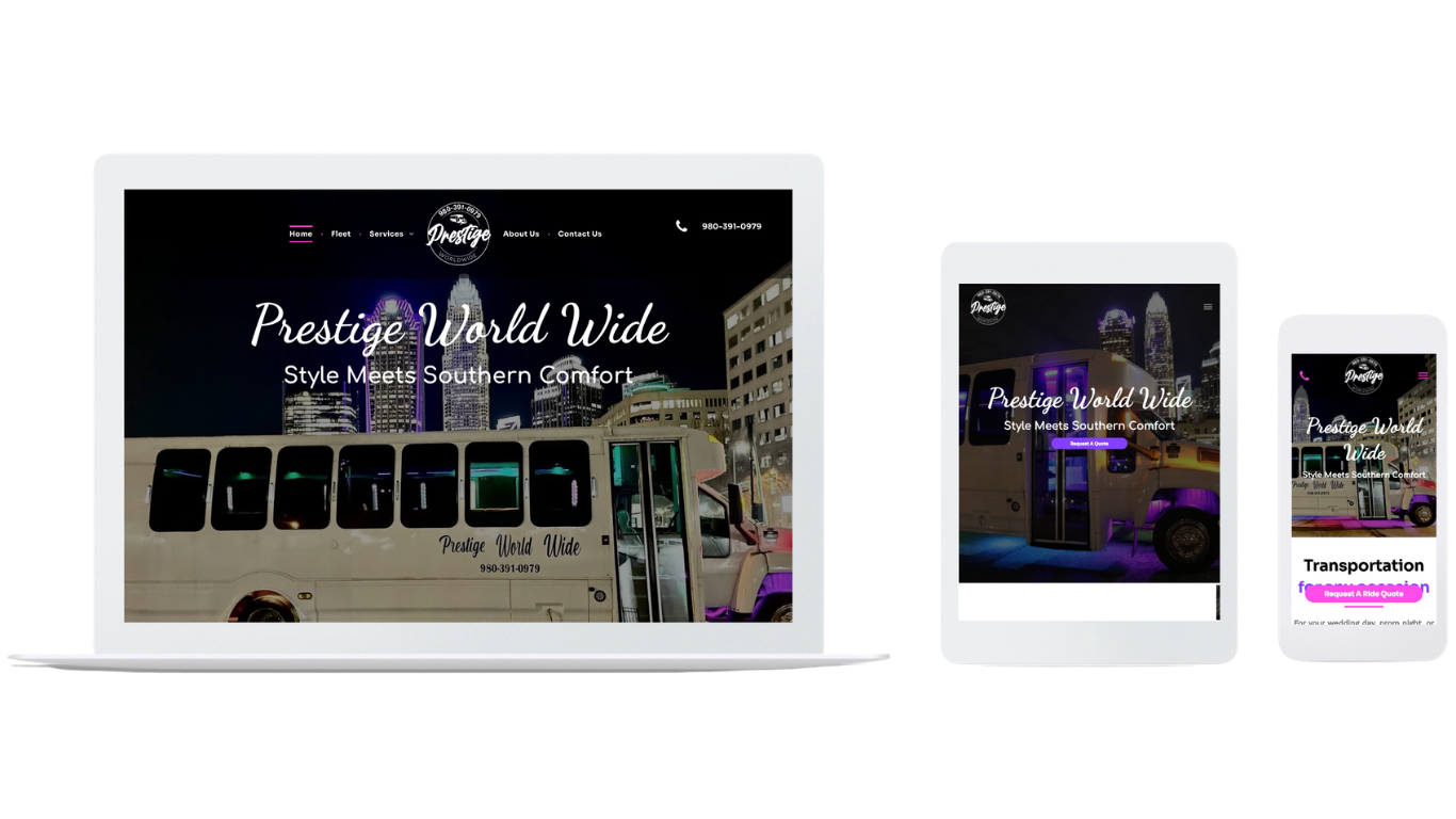
Prestige Worldwide Limos had a website. It was getting organic traffic. Their conversion rate was 5% — meaning 95 out of every 100 visitors left without taking action. After rebuilding their service pages with conversion architecture designed around how luxury transportation customers actually make decisions, their conversion rate went from 5% to 13%. Lead generation increased 414% year over year. The content didn't change. The services didn't change. The architecture changed.
This article walks through how to build a service page that converts — what goes above the fold, how to structure the content, which trust signals actually work, and how to give visitors multiple paths to contact without cluttering the page.
Start With What the Visitor Needs to Know Immediately
Every visitor who lands on a service page arrives with the same three silent questions running in the background: do you do the specific thing I need, can you prove you do it well, and how do I reach you right now. The architecture of a converting service page answers all three before the visitor has to scroll.
Above the fold — what a visitor sees without scrolling on the device they're using — needs to do the heaviest lifting. A headline that names the specific service and the specific outcome. A subheadline that addresses the most common concern your customers have before hiring anyone. A visible, clickable phone number. One strong trust signal — a credential, a client count, a specific result.
What most service pages put above the fold instead: a generic headline about the company, a hero image that's decorative rather than informative, and a "contact us" button that leads to a form nobody wants to fill out before they know whether they're talking to the right business.
The headline test is simple. Read your current headline and ask: does this tell a visitor who doesn't know my business exactly what problem I solve? "Professional Roofing Services Since 1987" fails this test. "Emergency Roof Repair — Same Day Response for Lowell, MA Homeowners" passes it. Specificity earns the visitor's attention. Generality loses it.
Structure Content Around How Customers Make Decisions
Below the fold, the content should follow the same sequence customers use when they're evaluating whether to hire a service provider: understand the problem, evaluate the solution, check the proof, take action.
Lead with the customer's problem in their language, not your service description in your language. A foundation repair company's service page should open by describing what a homeowner experiencing foundation problems is going through — the cracks, the moisture, the concern about structural integrity — before describing the repair process. The visitor reads that and thinks "they understand my situation." That recognition keeps them reading.
The service description should focus on outcomes rather than process. Customers don't hire service providers because of methodology — they hire them because of results. "We use a three-phase waterproofing system" is a process description. "Your basement will be dry, permanently, with a transferable warranty" is an outcome. The second one is what drives calls.
Proof comes after the problem and solution are established — not before. Most service pages lead with certifications and years in business before they've given the visitor any reason to care. By the time a visitor has confirmed you understand their problem and can solve it, they're actively looking for proof that you've done it before. That's the right moment for testimonials, project photos, and credentials.
Trust Signals That Actually Move Decisions
Not all trust signals carry equal weight for local service businesses. The ones that convert are specific, verifiable, and relevant to the decision the visitor is making.
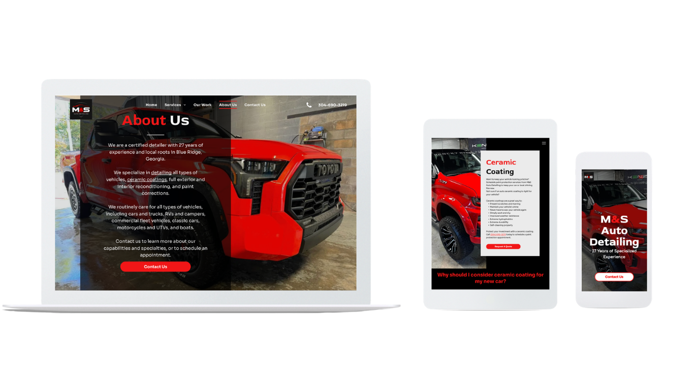
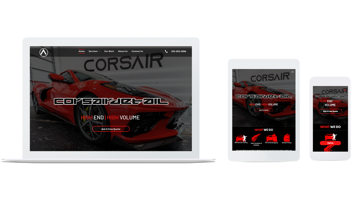
Real project photos beat stock images every time. A before-and-after photo of actual work done for an actual customer in your service area tells a visitor three things in one image: you do this specific type of work, you produce visible results, and you've done it for someone like them. Stock photos of generic finished products tell them nothing they couldn't find on any competitor's website.
Customer reviews with specifics outperform star ratings without context. A review that names the specific service, describes the specific situation, and mentions the outcome gives future visitors something to recognize themselves in. "They refinished our 1,400 square foot hardwood floors in two days and matched the stain perfectly to the existing stairs" is a trust signal. "Great work, highly recommend" is not.
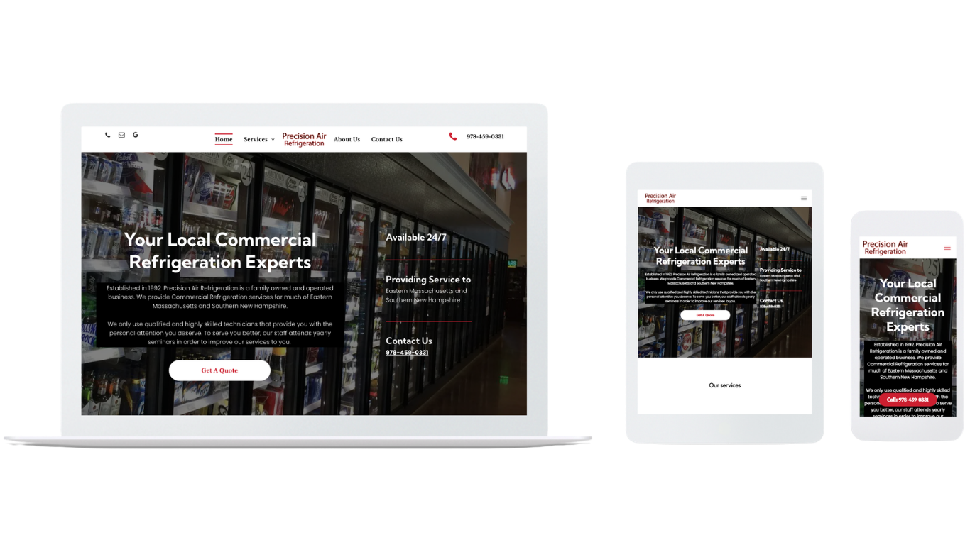
Credentials that explain their relevance convert better than credentials presented as labels. "Licensed and Insured" is expected — it doesn't differentiate. "EPA-certified technicians with commercial refrigeration clearance" tells a restaurant manager something specific about whether this company can legally and competently handle their equipment. Precision Air Refrigeration's rebuild featured their EPA certification and commercial client roster — including recognizable brands like Domino's, Wendy's, and Taco Bell — prominently on every service page. Their conversion rate went from 3.5% to 13.85%.
Mobile Visitors Need Faster Answers
A service page designed for desktop reading is a different page than one designed for mobile decision-making. Mobile visitors are often searching in context — standing near the problem, dealing with an urgent situation, comparing options while on the move. They scan faster, scroll less, and abandon more quickly when they can't find what they need.
The mobile version of every service page should have a clickable phone number visible at the top without scrolling. Contact forms on mobile should ask for the minimum information needed to start a conversation — name, phone number, and a brief description of what they need. Anything beyond that reduces submissions. The additional detail can be gathered on the call.
Page speed matters more on mobile than desktop because mobile connections are less reliable and mobile users are less patient. Every Forget Me Never Media service page is built on Duda specifically because the platform handles mobile performance at the infrastructure level rather than through plugins that need constant maintenance. A page that loads quickly on mobile earns the visitor's attention. One that doesn't loses it before they've read a word.
Give Every Visitor a Path That Matches Where They Are
Not every visitor who lands on a service page is ready to call immediately. Some are comparing options. Some want a written estimate before committing to a conversation. Some are researching outside business hours. A service page with one conversion path loses everyone who isn't ready for that specific action right now.
The primary call to action for a local service business should always be a phone call — it's the fastest path to a qualified lead and it gives you the opportunity to address specific concerns that copy alone can't handle. But the page should also offer a secondary path for visitors who aren't ready to call: an estimate request form with minimal fields, a clear response time promise, and an expectation of what happens next.
The follow-up system behind the form matters as much as the form itself. A visitor who fills out a contact form at 9 PM and doesn't hear back until the following afternoon has likely already hired someone else. Every Forget Me Never Media service page connects to automated follow-up that responds within minutes regardless of when the inquiry comes in. The page generates the lead. The automation closes the gap before a competitor does.
The Page Is a System, Not a Design
Conversion architecture isn't about making a page look good. It's about understanding that a visitor landing on your service page is in an active decision process and every element on the page either moves that decision forward or creates friction that stops it.
Josh builds every service page personally because the decisions that matter — what goes above the fold, how the content is sequenced, which trust signals appear where, how the contact options are structured — require understanding both the customer's decision psychology and the specific business's strongest proof points. Neither can be templated.
The service pages that generate the most calls aren't the most visually impressive. They're the ones that give the right visitor the right information in the right order and make the next step obvious.
No long-term contracts. No cookie-cutter layouts. Just service pages built around how your customers actually decide.
Table of Contents
IS YOUR BUSINESS READY FOR 2026?
Get a free digital marketing audit and see exactly where your biggest opportunities are hiding.